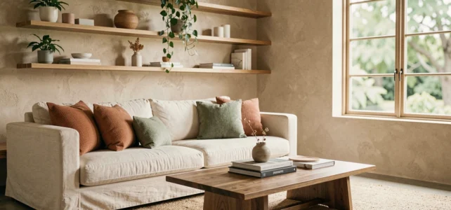
The coherence of an interior does not rely on the choice of a single style applied everywhere. It is built on mastering the transitions between rooms, the relationship between natural and artificial light, and the density of materials by living area. Here, we discuss the technical levers that concretely transform a space, far from interchangeable decor idea lists.
Color Temperature and Color Rendering Index: Lighting as a Design Tool
A lighting plan should be considered before choosing furniture. The color temperature expressed in kelvins determines the perception of a space far more than the color of the walls. A kitchen requires functional lighting between 3,500 and 4,000 K for a true rendering of food and work surfaces. A living room oriented towards relaxation drops to around 2,700 K, sometimes lower for accent lighting points.
The color rendering index (CRI) remains the parameter that most decor guides overlook. Below a CRI of 80, wall pigments and textiles lose their nuance. A bedroom painted in sage green will appear grayish under a low-quality light fixture. We recommend a CRI above 90 for any room where color plays a structural role.
Multiplying sources by layer (general, focal, ambient) is not enough if the temperatures are not coherent within the same field of vision. Mixing 2,700 K and 4,000 K in an open living room creates an unpleasant perceptual break, often wrongly attributed to the choice of wall colors.
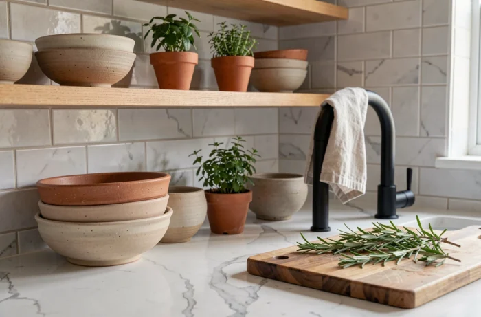
To delve deeper into these reflections room by room, the home section of Butterfly Mag regularly discusses layout choices with an accessible technical perspective.
Color Palette by Room: Thinking in Value, Not Just Hue
The common reflex is to choose a wall color from a color chart. The professional approach starts with tonal value, meaning the degree of lightness or darkness of a hue independent of its saturation. Two greens of the same hue but different values produce opposite spatial effects: one opens up, the other contracts.
In a narrow entryway, lowering the ceiling value by one or two tones compared to the walls creates an impression of intimacy without visually reducing height. In a living room with a beautiful ceiling volume, maintaining the ceiling at the lightest value pushes the gaze upward.
Relationship Between Fixed Surfaces and Mobile Elements
Walls and floors represent the permanent base. Furniture and textiles constitute the adjustable layer. A common mistake is to saturate the base and choose neutral furniture. We observe better results with the opposite: a medium-value, low-saturation base, and furniture pieces or textiles that carry bold color.
- A sofa in deeply saturated velvet anchors the room better than an accent wall and is easier to replace than paint.
- Dyed linen curtains bring color filtered by natural light, an effect that no wall can replicate.
- Cushions and throws serve as seasonal adjustment variables without heavy intervention, provided they remain within the same tonal value family.
Eco-Design of Furniture: What the ESPR Regulation Changes for Your Interior
Since July 2024, the European regulation ESPR (EU 2024/1781) gradually imposes eco-design requirements on nearly all physical goods sold in the EU, including furniture and interior decoration items. The delegated acts, being deployed until 2030, will define product by product the criteria for sustainability, reparability, and recycled content.
For furniture, a digital product passport (DPP) is expected around 2028 through a dedicated delegated act, followed by a transition period of at least eighteen months. This QR code integrated into the furniture will centralize composition, carbon footprint, reparability, and recycling pathways.
In practical terms, this changes the way to choose furniture for each room in the house. A living room sofa or a bedroom bed purchased after the DPP comes into effect will be traceable throughout its lifespan. Manufacturers anticipating this standard are already offering dismountable seating, certified wood structures, and foams without halogenated flame retardants.
Impact on the Choice of Decorative Materials
Decorative accessories (lighting, objects, upholstery textiles) will also gradually fall within the ESPR scope. Prioritizing short-cycle materials now (local ceramics, European linen, traceable solid wood) is akin to anticipating a regulatory constraint that will become the norm in a few years.
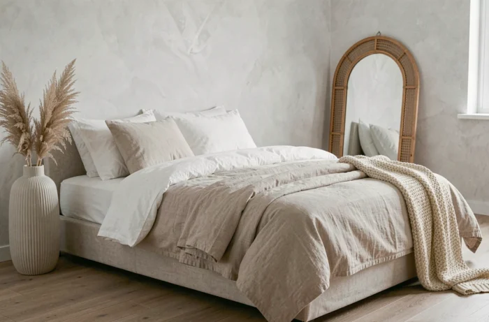
Proportions and Circulation: Ratios That Structure a Living Space
The rule of thirds applied to furniture yields more reliable results than intuition. A sofa should not exceed two-thirds of the length of the wall it faces. Beyond that, the compressed circulation space generates a feeling of clutter, even in a large room.
The distance between a coffee table and seating should allow for effortless passage, approximately the width of a bent knee. Too much space between the two elements breaks the unity of the living corner and encourages leaning forward, which strains the back and discourages using the table.
Adapting the Circulation Plan to Actual Use
In an open kitchen to the living area, the main flow passes between the island and the wall countertop. If this passage is narrower than the width of two people side by side, the island is too large for the room, regardless of its catalog aesthetics.
- Living Room: ensure a clear circulation axis between the entrance and the seating area, without having to navigate around furniture.
- Bedroom: the distance between the foot of the bed and the opposite wall conditions the fluidity of the morning passage, a minimum of a body width is necessary.
- Bathroom: the clearance in front of the sink must allow bending without bumping into furniture or a wall, otherwise making every daily gesture uncomfortable.
A well-designed interior is recognized as much by the empty spaces as by the filled ones. Unfurnished spaces actively contribute to the visual balance of a room. Resisting the urge to fill every nook remains the most underestimated, yet most effective, decor gesture.