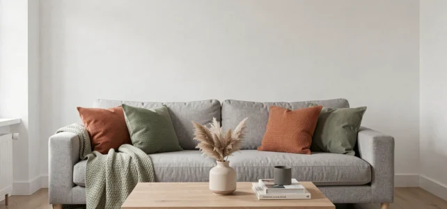
White and gray form a neutral base that absorbs or reflects light differently depending on the undertone of each shade and the orientation of the room. Matching colors to this duo is not just about picking a bright shade at random: success lies in the relationship between the color temperature of the chosen gray, the purity of the white, and the amount of natural light available.
Gray undertone and white temperature: the technical foundation to master
Each gray has a warm or cool undertone that guides the entire palette. A gray leaning towards blue or green will appear more mineral and distant, while a gray based on beige or brown (often called greige or taupe) will exude a cozy feeling.
White follows the same logic. A pure white reflects light evenly, while an off-white incorporates a hint of yellow or pink that softens contrasts. In recent years, very pure whites and cool grays have clearly declined in favor of warm off-whites and greiges, sought after for their ability to create more inviting atmospheres.
Before choosing an accent color, it is essential to identify the undertone of the gray present in the room. A simple test: place a sample of gray next to a sheet of pure white. If the gray appears bluish, its undertone is cool. If it leans towards brown, it is warm. To harmonize colors with white and gray, this identification determines the coherence of the entire decor.
Room orientation: a cool gray in the north looks different than in the south
Orientation radically changes the perception of the white-gray duo, a parameter that most decor guides overlook. In a north-facing room, natural light is cooler and more diffuse. A gray with a blue or green undertone becomes clinical, almost metallic, especially when paired with pure white.
A warm gray (greige, taupe) combined with an off-white corrects this effect in poorly lit rooms. The warmth in both shades compensates for the lack of direct sunlight.
In a south-facing exposure, golden light spontaneously warms a cool gray. A very pure white works better there than in the north, as it does not yellow under this type of lighting. The contrast remains sharp, allowing for the introduction of more saturated accent colors (duck blue, terracotta) without the overall appearance becoming dull.
Accent colors to favor according to exposure
- North or east room: favor warm shades like mustard yellow, terracotta, or old rose, which compensate for the coldness of the light and warm up a neutral gray
- South or west room: blues (duck, petroleum, Klein), deep greens (sage, olive), and even black in small touches work well, as the warm light naturally balances their intensity
- Cross-ventilated room (double exposure): natural wood tones, raw linen, and ochres provide a smooth transition between differently lit areas
Greige and taupe: the neutral base that replaces cool gray in interior decoration
Greige (a contraction of gray and beige) has established itself as an alternative to classic gray in contemporary palettes. Its uniqueness: it retains the sobriety of gray while bringing warmth that pure gray lacks.
Paired with an off-white, greige creates a background soft enough to accommodate raw materials (light wood, rattan, linen) without creating a visual break. This base serves both a Scandinavian style and a more rustic decor.
Taupe, darker and browner, serves a different role. It can replace an anthracite gray on a wall or a large piece of furniture, adding depth without the austere effect of very dark gray. Taupe accepts brighter color accents than greige, particularly sage green, muted blue, or powder pink, because its density absorbs the brightness of neighboring shades.
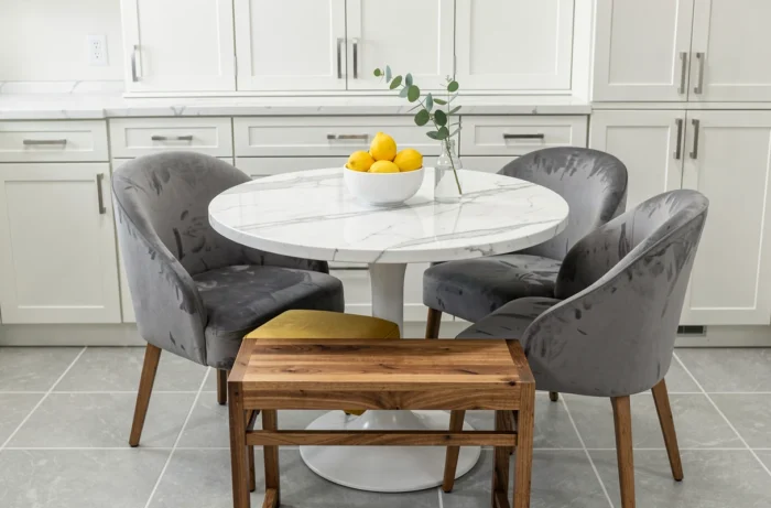
Combining white and gray in a living room or bedroom: the rule of proportions
The proportion between white, gray, and accent color determines the atmosphere as much as the choice of shades. A distribution that works in most configurations: the dominant color (white or light gray) covers large surfaces (walls, ceiling), the secondary color (darker gray or greige) dresses the main furniture or a wall, and the accent color appears in touches on textiles and accessories.
Gray and white living room: creating depth without overloading
In a living room, layering multiple shades of gray (from pearl gray to medium gray) on textiles, cushions, and curtains avoids the flat effect of a single solid color. White remains on the walls and ceiling to maximize light. The accent color, limited to one or two elements (a chair, cushions, a vase), provides the focal point without competing with the neutral base.
White and gray bedroom: favoring softness
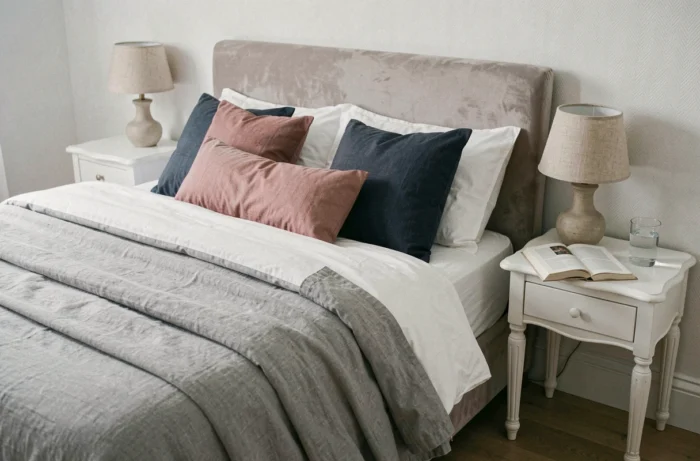
In the bedroom, dark gray works well as a headboard, while the rest of the walls remain white or off-white. Textures play as crucial a role as colors: a wrinkled light gray linen on the bed, a darker wool throw at the foot, and white sheets create a tactile gradient that enriches the palette without adding an extra hue.
- Avoid multiplying accent colors in a bedroom: one complementary shade is enough to maintain a restful atmosphere
- Light wood (bleached oak, ash) warms a cold white-gray duo without introducing a bright color
- Gold or brass metals add a subtle shine that breaks the monotony of an entirely neutral palette
The choice between cool gray and warm gray, between pure white and off-white, primarily depends on the light the room receives. Testing a paint sample directly on the wall at different times of the day remains the most reliable method to validate a combination before committing to several liters.